Wednesday, August 30, 2017

How Ravinder Reddy Undresses Women


(Ravinder Reddy)

On 9th January 2017, when the ‘Golden Bough’, the 50th Annual show of Birla Academy, Kolkata, curated by me opened, I was keeping my fingers crossed. Ever since the BJP came to power in 2014, there have been incidents of moral and aesthetical policing in different parts of India where female nudity in any work of art is heavily targeted. In 2015 February I had faced the tune of right wing moral policemen who had barged into a gallery in Pune where a show curated by me was on and their target was a painting by Manil-Rohit in which they had allegedly seen obscenity. They took me and the work of art to the Police station and the organisers agreed to immediately pack the work and send it out of the city limits of Pune! I was let off after some amount of shaming (the moral Police refused to talk to me for long because I was not responding to them in Marathi!).


(work of Ravider Reddy on display at RMZ Foundation, Bengaluru)

In Birla Academy, I was sceptical because I had presented a huge Ravider Reddy sculpture, a tall, imposing, upfront and bold female nude in copper sheen, which I thought would bring a mixed response. “It’s Kolkata, don’t worry,” the Birla team had reassured me. For them Birla Academy of Arts and Culture building is an impenetrable fortress with a strong contingent of security men guarding it round the clock but for me the surging right wing feelings in West Bengal has been a part of the daily news. Finally my fears were rested as people lapped up the sculpture with a lot of mirth than glee than the expected frowning and shyness. Perhaps, Reddy’s sculpture turned to be the best ‘selfie point’ in the show. There is something in Reddy’s sculptures that puts a person’s (lustful) gaze into a process of sublimation. The aesthetic finesse, the asserting counter gaze of the sculpture, the self asserting posture of the model and the unapologetic display of ‘her’ age and the resultant body folds together helps the viewer to detach the ‘srungar rasa’ from the direct imbibing of the (sculptural) body as an experience. To put it in other words, what gets commodified in a female body through fragmentation regains its identity as well as detached iconicity in the works of Ravider Reddy.


(Work by Ravinder Reddy)

In Delhi, on a short visit, Reddy arranges a meeting with me only to give me a copy of his latest catalogue, which I thought was a great gesture that hardly senior artists as well as junior artists do these days. The show to which this catalogue is a part is currently on at the RMZ Foundation in Bengaluru and if anybody in the city could see a comprehensive Reddy show till 31st October 2017. I do not know what I do here is a catalogue review or a review of the show itself which I have never seen. Whatever be the case I am very happy to go through the works of Reddy in this catalogue because with the help of a finely written essay by the veteran artist, Gulam Mohammed Sheikh, this catalogue itself is a guided tour not only to the show but to the very oeuvre of Reddy so far. Sheikh with his deep art historical understanding takes the reader/viewer in a chronological order against the backdrop of the larger sculptural history of India and elsewhere (but without imposing on the hardcore academic sculptural history) and explains how Reddy has confirmed, rebelled, traversed, digressed and finally found his own path in arriving at his own visual idiom. Hardly catalogue essays acknowledge the contemporaries and gurus unless they are really famous than the artist himself. Here, Sheikh is lenient enough to acknowledge Krishna Chatpar (who did not become as famous as his students) as the starting point of a generation of sculptors that include Dhruv Mistry, Reddy himself, late Ashokan Poduval and N.N.Rimzon.


(Work by Ravinder Reddy)

Much before feminist discourse started and when Bharti Kher was in around 12 years old, Reddy had already articulated which she would bring out in her own sculptures three decades later. Reddy, moved away from the organic forms that he experimented with in his early sculptures and with the finding of the flexibility of the new medium fibre glass he went on to do a series of works whose subject that he picked up from near around. It was an Upanishad of sculptures. Reddy looked at what the sculptors of the modern period was not really caring for (Kanai Kunhiraman, perhaps is an exception in this matter); the local women. Reddy’s gazed at them like a man but the result of that gaze was not an yielding body but a series of bold female bodies gifted with a counter gaze. Look at the works titled ‘Lady with Umbrella’ or the early relief works. They look like the works of an Indian Pop artist which Reddy should have been qualified as at that point of time but our art history parlance was so sacred that uttering the word ‘Pop’ was condescending for the time being. Duane Hanson was the only artist who had attempted such a language and the Reddy had very less chances of seeing those works first hand, and Ron Mueck was not even entered the college. But Reddy happened to be an Indian and was condemned to be treated as one of the fringe modernists who attempted on a language that had certain continuities and certain ruptures with the great Indian sculptural tradition.


(works by Ravinder Reddy)

However, as Sheikh points out, the typical body that Reddy created in his sculptures was accepted in art history as Bhupen Khakkar was successful in creating a typical Gujarati middle aged body type in his paintings. While the Indian Radical Painters and Sculptors association artists were still ‘experimenting’ with the expressionist sculptural language and finding their fibre glass surfaces garishly painted, Reddy was moving in an entirely different direction, which I believe, should have been called the nativity point of Indian Pop Art, in Indian terms. Though Reddy was not given that glory he definitely received some accolades from the post-modernists (I assume) that he has been an artist who brought the subaltern subjects into the mainstream and gave them sort of iconicity. Reddy in that case stands on a triple platform which perhaps wouldn’t make second and third places; Feministic Art, Pop Art and Post-Modern Art. But being male is a problem for an artist who could even involuntarily create ‘feminist’ art. As Roman Jacobson would put it “elephants to teach zoology”, we have had a problem that only women could produce Feminist art. Hence we had to wait till yet another decade for Navjot Altaf to take up the formalities of the same language and come up with ‘feminist’ sculptures.


(work by Ravinder Reddy)

A man of few words Reddy does not elaborate upon his works. His early works show a lot of affinity for his contemporaries, and also reflect a time when all of them had worked for fame and glory with the same positive competitive minds. So we could see the ‘sleeping figures’ of Reddy while we look at the ‘Yellow Pslams’ by N.N.Rimzon. We could see Druv Mistry presenting a man with a dog and the man resembling the static nature of Kuros, we see the same inertness in the Girl with a Bouquet in Reddy (Man with Plastic Bouquet is the offering of Bhupen Khakar). While Reddy makes women with stark eyes, there Rimzon makes ‘Man in the Chalk Circle’. It is so interesting to see these works happening and populating our art firmament as if they were the musical codes in a symphony. Reddy then matures up to explore the woman’s body as a body of no gaze and no eroticism. They are full of counter gaze and truth. I would call them the ‘truth bodies’ which have only scorn for the zero sized, lipo-sucked bodies. As Sheikh would put it, these bodies are nudes but only covered with the golden paint. In Hindu philosophy we say that truth is covered by a golden lid. But in the works of Reddy, truth is exposed in the golden skin.


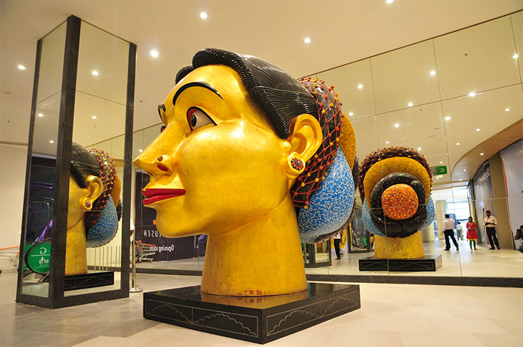
(Ravinder Reddy's work at Bangkok)

Whether it is Laxma Gowd or Thotta Vaikuntham, most of the Andhra Pradesh artists have this perennial infatuation and awe for the dominating female bodies. In their female worship perhaps they put the Bengalis into shame but Bengalis are more overt in asserting their worship of the female goddesses. But if you look at the physiognomy of the actresses from the Telugu region you could see how these fecund, fertile, voluptuous, ferocious and iconic ladies have been put against soft looking male leads. For example I would site Sharada Akkineni, Savithri, K.R.Vijaya and so on. Renuka Chowdhury was one such lady in the politics that I could site. Such ladies with exuberant energies automatically are worshipped or looked at awe in the visual culture, which could be a historical as we could see such depiction of female goddesses in the temple premises and gopuras and vimanas. Reddy derives the hallmark features not from the goddesses but he realizes that the above mentioned female beauties are the refined version that one could see in the rural areas who generally do not ‘take care of their bodies’ but let it grow the way it wants. Right from the beginning Reddy seems to have understood this. I wouldn’t say that he has been sort of infatuated by the possibility of these women having toothed vaginas capable of reducing men to nothing. But that submission, as Shiva to Shakti, remains as a possibility in his early works; look at the sleeping figures and the couple that makes love. Man is a worshipper, not a dickhead who does his act.


(Ravinder Reddy with his work)

Reddy refines himself as he grows and reaches to a stage where he could boldly feature these women with their actual physical attributes. Even the sophistication that he used to show as part of idealizing their bodies takes a backseat. Reddy invests more into the making of their body as it is. Also he focuses on the Head of women. There is a sort of deification in the process. Each woman who could be Kanaka, Bangauamma and so on, but they all turn into goddesses, who interestingly are identified as ‘Reddy’s works’ in the secular religion of art.  In due course of time Reddy has embellished his head and figures with decorated coiffures giving them at once a much desired regional flavour but at the same time a transcended sense of femininity. He brings them forth as people involved in simple gestures like squatting, like holding a garland, tying hair, checking the length of the hair and so on, each gesture transporting them to the ultimate zone of erotic potential. But a man would think hundred and one times to venture before approaching her. She is there to evoke the life spirit in you, but never to yield your fantasies for in her there is no fantasy but only the truth of being a powerful entity. She does not have anything to hide but only to expose and in that exposure and in that stark nudity she defies the gaze and reveals that she is the body of the golden truth of existence.


(work by Ravinder Reddy)

The biggest success of an artist happens when a viewer sees a work of art by him/her thinks of him/her rather than a series of possible other artists who have done or inspired this work of art. Reddy is lucky to be one of those artists who wouldn’t evoke any other artist in the mind of the viewer. In fact it is always a pleasure to look at the early of this artist and see how he has taken the process into interesting zones of making a relevant form through interesting themes. Once an artist reaches a point and what he needs to do is to make permutations and combinations of the same. But even in that playing with forms, each time the artist must be feeling the unpredictability of the outcome. Each expression in Reddy’s works perhaps looks like one constant gaze (of compassion and defiance at once), but I believe that to get that the artist has to thrive as if it is his first time. Each work has a model and depersonalizing her and then giving her a new identity which even the model herself would desire to be is the challenge of the artist and I am sure that Reddy handles that challenge very well.   

Tuesday, August 29, 2017

Spirited Away: The Works of Subir Hati


(Axis Denied by Subir Hati)

Glenfiddich Single Malt Whiskey is very tasty. It’s give you a slow high with its effect lingering on as a sweet memory refusing to fade. I am not doing the company’s advertisement here. Good companies advertise their products with works of art and bad companies with mineral or sparkling water. Glenfiddich, like Absolut, Skoda, BMW, Samsung and so on, supports art and it gives three months residency to artists from various parts of the world. Subir Hati, a Kolkata based artist went to Scotland where the Glen breweries are located, spent three months in the locales with artists from different places and upon coming back did a series of works besides the ones that he did after the ‘residency inspiration’ and they are currently on display at the Art District XIII at Laddo Sarai, New Delhi (The former art district has now reduced to a Panchayat with gaping holes where galleries stood a few years back). Titled ‘Fly Ash- the Phoenix Redefined’ this show has some very pristine works of art that Subir Hati could always feel proud of.


(artist Subir Hati)

Fly ash and Phoenix could be connected only in the matter of something burnt down; what remains is ash. The rebirth of fly ash is always as bricks that go into the making of buildings. Phoenix is a mythical bird that is said to resurrect from its own ashes. While Fly Ash is not a great metaphor, Phoenix has been a sought after metaphor especially by all those who have tasted the bitterness of failure at some point of life and come back to life with certain grand achievements. Behind every success story there is also a sob story; ash belongs to that side. I could not really connect these two parts and believe that the artist should have something very personal to name the so show. I could not connect the title with the show mainly because the works are so beautiful and thought provoking at once and there is no chance of them evoking burning down anything or even attempting self immolation. I leave that part to be explained by the artist at a later stage in his life perhaps in his autobiography.


(Handmade Flowers by Subir Hati)

The show has three major components; sculpture, paintings and sculptural installations. What gives you a mixed feeling about the show is a large scale copper metal welded sculpture in the shape of a huge bug titled ‘Oxidised’ (medium: oxidised metal). You immediately think of an artist like Janakiram or Nandagopal. But Subir has a different take. He plays with materials in different ways still sticking to the variations of a single form; the bug. Perhaps, you don’t see it in his paintings. But all his sculptures have this dried insect form coming up. It is visible in the works like ‘Mirror in the Frame’ and ‘Impressions of a Melancholic Milieu’. The artist attempts to remind the viewers about mortality and the eventual turning of every living organism into shapes recognizable only when employed in a familiar zone of comprehension. Thus these body parts (dried and skeletal) not only become memento mori but also turn themselves into a language that seeks fulfilment in recognition by the other. Hence, these shapes/forms/images are also a sort reminder ‘Nature Morte’. The mirrors fitted into them give a fragmented reflection of the viewer almost making it impossible to see the face reflected there. It is not a dehumanizing reflection but a depersonalising one. The ‘who’ in the shell of the word ‘who’ is not the ‘who’ recognised in the reflection on/of/by others. Great lesson through adequate visual means.


(Handmade Flowers and Framed Mirrors- display view by Subir Hati)

There is a series of small sculptures that could be crumpled unrecognizable objects, plastic bottles or even deflated balloons. But they are not of the above. They are ‘Handmade Flowers’. They fibre glass flowers (wilted ones) chrome painted. They are many in colour and somehow Subir deflates the gigantic spectacular sculptures of Jeff Koons and brings them to a kind of miniature scale. I would like to believe that it is a conscious effort to reverse the process of spectacularisation into miniaturising the objects involved in the spectacles. While they could also be the beautiful reminders of the decaying life after death, it could also be seen as the sheer materiality of surfaces and shapes that allure the people to touch and feel the objects but are denied the chance or even if given the chance the expected tenderness is felt as an illusion; a displaced softness. The aloofness of a spectacular world is captured in this work by the artist.


(Lying down in Others Land- by Subir Hati)

‘Lying down in others Land’ is an unassuming installation flattened out on the floor with some forms vaguely resembling the dragon flies landing on a plastic earth (a disapproving or an unwelcoming one) and stuck there in the process. I do not know whether while doing this work, Subir was thinking about the displacement of people from one war torn land to the secure ones in Europe. Even if he was not, subconsciously, one could see the artist responding to the mass migration issues; you as an exile or a migrant are as brittle as a dragon fly and you are about to land in a place but that place doesn’t quite receive you with open arms. The same theme comes in a different work, which I think is one of the favourite works in the show, titled ‘Dark Sky’. This is a vertical sculpture which is porous and vertical from floor to ceiling, formed by interconnected monochromatic butterflies. They are all white so you wouldn’t really see the butterflies in the first look and as you look up you see two layers of these humble little beings turning to pitch black. Suddenly the white portion becomes earth and the dark portion becomes the dark sky. It is also a tree of life with a white bark and a dark canopy. This could also be the hopelessness of ‘flight’.


(Impression of Melancholic Milieu (R), Frozen Sun and Sun Catcher (Far)- Subir Hati)

There is a series of small twenty frames generally titled ‘Axis Denied’; once again I do not know how the title opens up a window for the viewer to view into. But the work is crystal clear. Perhaps, I have not seen such exquisitely done metal sculptures of late. They look as if done with copper metal sheets and other shapes by the same metal with added colour here and there for effect. This is a bug world; a cabinet of curios, beautiful bugs collected from all over the world. They are non-existent bugs that Subir creates out of his extreme skill and craft in ornament making. If you could wear a bug for the party, then buy one and hang it around your neck. This is the work that any wife could bring home and declare to the husband, ‘baby look, who I have brought’. A husband could do the same without making the wife frown. This is a work that a young girl could hold in hand and show to her mother. A young guy also could do it. This is a Kafkaesque world run through the alchemy of Subir’s ornamental dexterity. This is what I would show how aesthetic finesse and traditional craft of ornament making could brought together without compromising both; looking at them, one would feel good about fine art and fine craft.


(Axis Denied display view -Subir Hati)

Subir’s paintings are optical in a way as if they were done first in origami and later painted on canvases with adequate illusionary effects. Even this origami effect could be seen in a relief sculpture done in wood titled ‘Frozen Sun and the Sun Catcher’. The paintings are in a Riley-esque and Mondrian-esque. I am not saying that the artist has picked the threads from either of these artists. My effort is to evoke a near similar visual impression among the readers. However, this artist’s forte is sculptures and the paintings are sculptural in their illusionistic effects. Subir has an immense possibility ahead of him to catch on time and experiment with. He has the modernist formal and technical grounding, and also he has the conceptual rigour to push the works beyond mere formalism. I would be happy if he wouldn’t burden the works with so much intellectual burden. 

Monday, August 28, 2017

How ‘Tihar’ Project fails the Curator in Veer Munshi


(artist curator Veer Munshi, courtesy India Today)

‘Tihar’ is an exhibition of forty contemporary Indian artists and around hundred prisoners lodged at different jails in India, prominently in Tihar, Delhi, hence the name Tihar. This is a joint venture of the Delhi Police with Sahitya Kala Parishad and Central Lalit Kala Akademi. Noted artist Veer Munshi is the curator and the co-curator is artist and one of the member of the Lalit Kala Akademi, Vijendra S Vij. Veer Munshi, in my view is the salt of Delhi’s art; an essential ingredient. A pleasant man with connections across artists and activists, Veer has also curated a few shows of which I remember, ‘Back to School’ which had featured his contemporaries from Baroda School (MSU, Baroda). But if you ask me to rate this curatorial venture and mark it out of ten, I would give two marks to Veer and one mark to Vijedra and you may choose to call it a flop show. Before you rise cudgels against me let me explain why I rate this so low.


(work by one inmate)

It is not a ‘Veer Munshi’ show and that is the primary reason. It could be anybody’s show that takes place in government buildings, hotel lobbies, ICCR and so on. Then why did this artist with considerable reputation amongst the peer group and in the art scene in general get into such a shabby work? That is where the dilemma of some people who is a good friend of everyone and finds it difficult to say ‘no’ or refusing to lend one’s name to a project. Anybody who visits the show understands that there is no curatorial intervention in the project at all. Small town galleries could hang works better than this; and even they could hang better works than what you see in this show. The reason for this shabbiness is simple and understandably a disease that eats up the core of most of the national and regional academies; quantity over quality, ever ready to please the political bosses, yielding to a vague notion of democratic approach even when democracy gets butchered in all the other fields, urgency to do short term projects and above all killing a project by ‘contributing’ artists to the project. The above mentioned reasons simply round up how public sector art projects mostly fail. Hence, whether you use the name of Veer Munshi or one of the international toppers like Germano Celant, the result will be the same. It is a Beuys-ian dilemma- how to explain stories to a dead rabbit. What a curator could say is, again in the Beuys-ian fashion, ‘I love India, India hmmm...loves me.’


(work by Farhad Husain)

According to the co-curator of ‘Tihar’ (the curator would come only in the second half of the day. I doubt, he would dare) this exercise was initiated in June and a set of senior students were taken to the Tihar Jail and conducted an intense workshop with the jail inmates who were inclined to do some art. By July, the contemporary artists were contacted by the curator and then ten artists each were contributed by the Sahitya Kala Parishad and Lalit Kala Akademi respectively. I am sure Veer agreed to do this project because he had experienced a Tihar project in 2009 when I was the curator of the project which was initiated by the Ojas Art Gallery in Delhi. He might not have anticipated this outcome. You may find it why I am pitching more on Veer; I do not have any other devise to talk about this eminently avoidable exhibition. But what makes the show interesting is not the works of the contemporary artists but the works of a few inmates who have done works independently and collaborated with the contemporary artists.


(Sudhanshu Sutar in collaboration with one jail inmate)

Art for people from any situation is a way to self refinement, meditation and confession. That’s why many a shrink says that art is therapeutic. Frank Cizek, who had studied art of the children used the terms ‘diagnostic’ than therapeutic. When it is diagnostic, you would understand what ails the person who has made that art. When treated as therapeutic, art becomes a part of the remedy than diagnosis. I would prefer to look at art as diagnostic than therapeutic because by looking at the works one could see what really is going through the artist. In Tihar or in any other jail, when the inmates do art, they do not do it as a therapy but as a confession; it is a sort of opening of and a response to it with a lot of compassion, consideration and understanding could alleviate the person from that situation, if not from the physical walls of the jail. There are NGOs doing art projects in Tihar and other jails orienting themselves to the therapeutic mode. I am nobody to judge whether it is doing good or not doing good, but what I want to say is that there is an added interest to the art of the jail birds recently.


(Pratul Dash's work with five other inmates)

You come across five kinds of works in this exhibition: one, paintings done by the contemporary artists, paintings done by the inmates, paintings done by the contemporary artists in collaboration with the inmates, some terracotta works and finally, the furniture with exquisite ornamental wood carving done in the Tihar carpentery workshop. Most of the inmates, as they are confined and living under strict rules, imagine a beautiful world elsewhere, mainly in their minds. Many are lovelorn souls and they find their love expressed through the image of Krisha in various postures with his Radha. One could get the religious cross section of the inmates also. There are moments when the inmates really become idealistic as they find themselves confined for an extensive period. So they are the first to make works with social message, which surprisingly I found often related to the protection of women and respecting women in the public domain. The reason, from my research almost eight years ago in the Tihar Jail number 5, is this that most of the inmates are young and several of them have committed the worst for fulfilling their love affair or proving their manly worth to the love interest. It is not rare that in the moment of depression they carve the girls’ names on their body with sharp objects.


(work by Phaneendranath Chaturvedi)

Some of the inmates are very idealistic. They even go back to the national history and bring images of Gandhiji and the freedom fighters into their pictorial scheme. Most of them are done in a naive fashion. A few of them have got good artistic hand and complete control over the colours. They are in fact artists who happened to have committed crimes. Sudhanshu Sutar, a contemporary artist from Delhi works with an inmate Mukesh Prajapati, who has an exquisite way of painting nature in order to complement the one pupa and larva painted by Sutar. Balagopalan, another contemporary artist works with Mukesh Soni, another inmate and Soni writes a grand statement about his confinement and exhorts the world that even in the worst confinement one could do the best for the world. Pratul Dash, one of the Delhi artists has worked with six inmates to create an interesting canvas which too has a dominant nature theme, perhaps seen only in the collective dreams of the captives. Farhad Husain humours the viewer with two seated inmates while an ‘angelic’ policeman hovers above their heads, in his typical style. Phaneendranath Chaturvedi, in his hallmark style has brought out a man confined in himself and how the body turns into a torture chamber. Sanjeev Sonpimpare and Prashant Sahu also have done works worth remembering. The rest is a haze.


(works by Chintan Upadhyay)

There are two works by Chitan Upadhyay, who is currently lodged in the Thane District Jail where he has recently started painting for himself and giving workshops for other inmates. The jail authorities have sent fifteen paintings from Thane itself, a commendable achievement within a short span of time since Chintan started working and giving workshops. One of the works by Chintan shows a stylized elephant as we have seen in Dali complete with its feet in polka dotted socks. Another one is a flower vase with closed flowers. If I have claimed anything about diagnostic, then I am lost here. Chintan comes across as a very closed person in these two works. He is a garden but not letting anyone smells its fragrance; stand aside and watch, do not touch me. I am an elephant capable of changing forms, tread carefully, I could hurt you, he seems to say. These are works that need careful analysis.


(work by Veer Munshi)

Veer Munshi also has done a scrap metal welded sculpture; obviously they are iron chair frames sourced from the Tihar dump. Finally, let me count the number of curatorial failures: one, there are no title or name cards to accompany the works, hence you don’t know who did what. Expecting that the viewers would understand the artists by their style or signature, expect for the artists named above , I did not recognize anyone. The narratives of the jail inmates are always interesting and full of pathos and hopes alike. For them, each painting is the narration of a dream that they have dreamt or dreaming to dream. Hence, what you expect minimum is a short note on each work either by the artist or by the curator/s. There is nothing given in terms of literature. There is no wall text or a press release as handout. Upon asking Vijendra told me that the brochure is getting ready and it would come within two days. Yes, I understand. On 31st the show ends and on that day you have all the brochures ready. The bills are cleared, the brochures are sent to kabadi in bulk or rot in some government storage. An exhibition of this kind helps the society to understand the role of art not in normal life but the unusually dissimilar life inside the jails. In order to make it happen, there should be plans and strategies to get the message across the society. Nothing has happened so far. Even there are spelling mistakes in the invitation card (Sahitya is written Satiya). A huge waste of energies and potentials. 


Sunday, August 27, 2017

Manu Smruti: Manu Parekh at NGMA, New Delhi


(Manu Parekh-pic courtesy Daily Mail. All the pictures used in this article are just representational)

Manu Smruti. Please do not get me wrong. It is just about Manu Parekh recollecting his six decades long creative career in a well mounted show at the National Gallery of Modern Art, New Delhi. In his address during the inaugural function which I could hear in one of the video recordings, Manu Parekh remembered how artists of his time strived to remain creative artists while they sought their daily bread from elsewhere. Lucky ones had got it from the same field through art teaching in schools or colleges but the ones who were destined to run a longer innings got their bread from elsewhere, as in the case of Manu Parekh who had worked with the Weavers’ Society ably led by the illustrious art connoisseur and scholar, Pupul Jayakar, for over twenty five years. And we know about Krishen Khanna, who worked in the banking field for long and still going strong, who happened to be the chief guest of Manu Parekh’s Retrospective show, though interestingly and ironically nowhere in the publicity materials including the handout and the book published by the Aleph Publishers in collaboration with the NGMA the word ‘retrospective’ is used. I do not know whether the word retrospective has gone out of parlance but looking back at the oeuvre of an artist who has a sense of accomplishment and fulfilment in life should be a ‘retrospective’ though the ‘in term’ ‘comprehensive survey’ is used in the forward to qualify the show under consideration here.

The turn rightwards in the new wing of the NGMA takes the viewer to a dark area of display where the darkest works in the career of Manu Parekh are on display perhaps, I would say the best works in this artist’s career. The series presented there is called ‘Man Made Blindness’. The works done on canvas with thick application of oil colour (though not obviously impasto in technique), these works show dark cubicles resembling prison cells where people are seen tormented by the forced blinding. The works have Bacon’s struggle and Rouault’s ferocity and the dark dungeon feeling evoked by the artist sucks the viewer into a sense of discomfort. The works were done during 1981 and 1982 and it came as a spontaneous and painful response to an incident of ‘mob justice’ happened in the winter months of 1980 in Bihar’s Bhagalpur District. Parekh’s title is a bit misleading; ‘Man Made Blindness’. In the feudal land of Bhagalpur there used to be so many goons led by politicians, local mafia dons, upper caste landowners and so on. They used to rape, loot and murder people while the administration stood a mute witness to all those atrocities. A bunch of twenty thugs were rounded off by fifteen frustrated policemen and delivered justice to the public by blinding the thugs and pouring acid into the cavities where once the eyeballs rested. This rocked the national conscience and the people in Bihar came out in the street saying that if the government punished the policemen Bihar would burn. People stood with the police. This incident was later made into a film, Gangajal (2003) by Prakash Jha where you could see a frustrated bunch of policemen led by Baccha Yadav (made the role into history by the NSD alumnus Mukesh Tiwari) blinding the goons in the police station.  


(work by Manu Parekh. source net)

The ambiguity of Manu Parekh’s titling of this series makes the viewers ask a question, where exactly the artist stood in those days or even today vis-a-vis the Bhagalpur blinding case. The title says ‘Man Made Blindness’, which is a neutral title and to push it further you would see it as a bit accusatory. Had the artist been supportive to the Policemen who blinded the thugs, he would have perhaps come up with a different title. This may be a critic’s imagination working like a forensic expert. But upon checking the history of this blinding case, I came across report came up during those days of the incident presenting a divided society on the case. Those people who supported the mob justice which was further supported by the mob had argued that it was the only way to deliver justice where the delivery systems have been failed or rendered useless. But there was a different conscience at work which argued that this mob justice was uncalled for and the human beings did not have any right to take away ones’ right to ‘see’. They were humanists and humanism still prevails especially when the discourse of capital punishment and euthanasia comes up in the society. The faceless society, a single hungry monstrous organism opens its mouth and demand death for the culprit/s, conscience keepers of the world or of the country say that there is still chance for them to reform and spend their life in repentance in the correctional facilities. Perhaps, I believe that Manu Parekh was with the humanists then and he found the dark incident a bit too much for his tender heart to soak in. It was a bitter pill to swallow and an unhealthy social food to digest. So this series should be seen in this light of the artist’s humanism.

While I was travelling from Ahmedabad to Delhi with Manu Parekh, he had told me how he was excited to show the works from that particular period and I too had expressed my interest in watching the Bhagalpur paintings. After watching them, now I would say that Manu Parekh has been forced to remain as an under rated artist all these years. If this artist had done such forceful works, and surprisingly these works are not collected by anybody so far, why he was not taken to the next level of artistic journey by the art market or art scene, remains an enigmatic issue. A similar case was seen when A.Ramachandran’s retrospective was shown in Delhi. His highly evocative, political and critical works done during the 1970s (including the Anatomy Lesson, Nuclear Ragini, and Kali Puja and so on) were under discussed and under estimated as they still remain in the ‘artist’s collection’ category. I believe Manu Parekh’s best phase as an artist was in 1980s though he has always showed the ability to come up with such forceful works in different phases in the following decades, the darkness of 1980s actually should be the decisive point in Manu Parekh’s creative life. You may find it ironic why I give so much praise to the dark phase of an artist’s creative career because it is in the dark phase the artist as in a Bergmanesque moment come to play chess not only with life but also with death. Dark phase is the moment before revelations and when things are articulated from the darkness, as there is nothing to lose nor anything to gain, the utterance remains truthful and effective.


(Work by Manu Parekh. Source Net)

That does not mean that Manu Parekh remain ineffectual during the rest of his career. Bhagalpur blinding was interpreted even by the mainstream media as a ‘symbolic castration’ (though the reports referred Freud, we could even go back further to meet Sophocles and his Oedipus blinding himself to atone for the sexual transgression that he committed with his mother. So he blinds himself.) And also blinding, the symbolic castration is a challenge on the patriarchal authority as good as Bobbitizing. But our artist is a man who has always taken pleasure in painting erotic imageries where the surrogate forms of human sexual organs infest the pictorial surface. Here you see multi-headed male genitals taking the shape of tubular forms like a Hydra Head and trying to enter into all the possible forms of hair vaginas often camouflaged as flowers and leaves. This sexual imagery comes back repeatedly in every stage of the artists’ career may be as a reminder of his own sexuality as an artist. What I notice is his effort to stick the porcelain votive eyes of different sizes stuck on the paintings and sculptures in different times and stages. These eyes also become potent erotic symbolism that not only represents female sexual organ but also the male power of penetration. At this juncture I wonder whether the ambiguity of the Bhagalpur series titles comes from a castration fear of the artist not as a person but as a collective male.

It is true that most of the artists who have had a career spanning over six to seven decades must have invariably gone through a Picasso phase. Right from Ram Kinkar Baij to K.G.Subramnayan to anybody who is a modernist have had their Picasso Blues. Manu Parekh, may be by choice shows the reference of Picasso’s famous braying horse head from Guernica in one of the early works. But then you don’t find any overt reference Picasso and that I find a great relief and a great distinction of Manu Parekh. Another impressive series is his drawings done on the rice paper with mixed media. They are simple evocations of feelings and impressions and quite spontaneous. Whenever people talk about Manu Parekh, the first thing that comes to their mind is his Banaras series. As a young man and also as a part of his endless travels in North Indian states as a part of the Weaver Society employee and a folk art activist, Parekh had come across the immense visual possibility of Banaras at a very early age. Ever since, time and again Parekh was going back to his favourite theme of Banaras. When he goes through a pleasant phase, we see his Banaras thriving with pleasant colours, and when there is a darkness looming large in the firmament of the country his Banaras sheds dark tears from red eyes. Today he is a fulfilled artist and his Banaras has achieved pinkish features and all happy fluorescent and vibrating. Banaras for Parekh is not just a theme, but it is an organism that lives in his canvases and it responds to the touches of his brushes.


(work by Manu Parekh. source net )

Manu Parekh is not a political commentator, but at the same time, as I pitch my views on the Bhagalpur series, I would say that Parekh is not blind to the socio-political developments. He does not anywhere reveal his political leanings through the colours of the flags. Nor does his temple structures look anything like that you see in Banaras. The chance of accusing him of being a Hindutva person is lost there (you see I was really digging to find some old bones). The temple structures are more like caves and ashrams where one person could hardly sit and meditate. What I see is a lot of Kabirs sitting and singing than Lord Shiva sitting in magnificent temples. But even before the BJP could even dream of central power in India, Parekh had been painting Shiva-Shakti (which I would say Manu-Madhvi) in various forms. He has done a series of paintings showing the images of stones that even do not look like Shiva Lingas. Even the recent Shiva series do not look like real lingas because Parekh gives a bird’s eye view of the luminous lingas. So I lose a chance to catch the veteran’s Hindutva leanings there also. I am a big failure here. Interestingly, at some point of the cow discourse that has been throughout the last century and its embers still glowing towards its last decades, comes up in Parekh’s paintings and the cow heads look at us with some kind of question. It is a relevant painting to be shown at this juncture in the NGMA and Parekh got away uncensored. I should congratulate Adwaita Gadanayak for not becoming a Palhaj Nihlani and more like a Prasoon Joshi, who knows his lines and tune well.

There are some sculptures and sculptural assemblages that Manu Parekh has done during his career. The ones present in the show tell me that they are all done during the last one decade. Several of them are welded iron sculptures with the components sourced from farm implements and other working tools. There are two bronze busts of unknown person with slashes across the faces with blood still fresh in the wounds. They look like the drawings of Giocometti; intense and hopeless at the same time. There are two stunning portraits by Parekh; of Tagore and of Souza. They are exquisitely done portraits with adequate expressionism of his own kind going into the making of both. This is where the question always comes back to me; why Manu Parekh was not a part of the Progressive Movement, in which Krishen Khanna could find a place as the tail ender? Parekh still has an wounded feeling not to be a part of the group. I strongly believe that Manu Parekh also should be treated as one of the Progressive movement artists who shared the progressive ideas and ideals. But then the technical reason could be this: when the Progressive Group was formed in the late 1940s and after its formal dispersal when it grew on its own feeding on legacies and sagas, initially Parekh’s works were not really corresponding to the Expressionism of the Progressives. At that time Manu Parekh was more influenced by the folk and tribal art and was trying to imbibe some sort of indigenous aesthetics into his works. Manu Parekh chose to resist the easy pull of the Tantric Abstraction that led the indigenous art experiments for over one decade and by the time the narratives were experimenting with a national and international narrative style, Parekh had just embarked on his real stylistic expressionistic venture. Perhaps that historical dilemma is what makes Parekh as an artist of his own worth and my demand him to be included in the Progressive Group of aesthetical basis is not just a friendly demand but a historical one which I am sure sooner than later the auction houses would accept without acknowledgment.


(Manu Parekh, picture courtesy DNA)

Here we come to the last work; the Last Supper, Christ and his twelve apostles are feasting on the eve the terrible betrayal. Standing in front of it I think only this much: Can Madhvi comes Shall Manu be far Behind? Recently, Madhvi Parekh’s ‘Last Supper’ was celebrated nationally and was even presented in a church in Kolkata by the Seagull group. This is a beautiful example of husband getting inspired by the success of wife; Manu Parekh underlines how he had really worked hard to make people to take a look at the work of Madhvi Parekh who did not hold any art degree in hand. The Last Supper is thirteen different portraits of different types of people, each one having a still life kind of image before him, and arranged in the line of ‘Last Supper’. I would like to read it as a Last Supper which could be used as a jigsaw puzzle, perhaps first in the world art history; you could deconstruct the hierarchy. It is the possibility of this work though it is framed tight as one work. If I was the curatror of the show I would have presented those twelve pieces differently on the same wall, letting the viewers’ eyes to bring them together. As W.B.Yates puts it, beautiful women eat a crazy salad. I wish all the best to Manu Parekh and this is must visit show.   

Thursday, August 24, 2017

Jagannath Panda, the Oracle in his Crystal Cities


(Artist Jagannath Panda, source Facebook)

Perhaps this is one solo exhibition that you would miss the details if you wouldn’t really visit the show. In case you are planning to buy any work of art from this exhibition, please make a visit to the gallery even if the gallery management sends you a three sixty degree view of the exhibition/works. Yes, I am talking about the latest solo exhibition of Jagannath Panda at the Vadehra Art Gallery, New Delhi which is on view till 12th September 2017. The show titled ‘Crystal Cities’ demands close scrutiny and the images just don’t do any justice to the works. Hailing from Odisha, educated in the MSU, Baroda and Royal College of Art, London, Panda has been one of the artists who could establish himself by the time he finished his education; while in London, Panda got into a few experimentations with sculptural forms and verbal language besides doing a few videos, one of which had dealt with the facelessness of urban life through the image of a closing and opening door of an elevator and the booted feet going out and coming in.


By the second half of the 2000s when India’s art market was thriving mainly on painting (mercifully this time not just oil on canvas), Panda got into making a lot of paintings in which his major concern was the fast growing and metastasising urban reality called ‘Gurgaon’ (now Gurugram and formerly Gur Gavaan) and the hopelessly trapped people and animals there. The language that he experimented with was in a way a trendsetter for many a Odisha artist who started literally emulating the same which had forced Panda to make yet another quantum leap to a new visual lingua that heavily depended on the traditional textiles as well as imageries of/from Odisha. The collages on canvas was but short lived an experiment for Panda (as far as I know because in the contemporary art history we have a very clear rupture/break/lacuna/hiatus of five decisive years. Now Panda has come back with a vengeance, a sweet one at that.

(Speed Metal, mixed media)

Let me once again remind the reader of the video that Panda had done in 2004. This was presented in an exhibition titled ‘The Twilight Zone of the Great Indian Digital Divide’. After thirteen good years, I would say, Panda has gone back to the threads that he had left loose there in the video. If there were so many people coming out and going into the lifts in that work, the present body of assemblage-drawings (let me coin that term in Panda’s case), paintings with mixed media (acrylic fabric, glue on canvas) and the sculptural installations (wood, fibre, plastic, artificial turf and so on) more or less erase people from it. But imagine a scenario where a ghost elevator comes, opens and goes up or down, constantly. That would impart a very eerie feeling, exactly the way Gigi Scaria’s ‘Elevator from the Third World’ which he had shown in the Venice Biennale a few years back. In Panda’s case, he presents a city almost erased out of people and in its place huge futuristic structures come up; they are neither dwelling units nor famed architectures but sort of space ships landed for regulating the urban lives.

I say these works of Panda are futuristic because the structures, that in a way the structures imitate broken mirrors that crystals (as the title suggests) but they are just incapable of ‘reflection’; these surfaces do not reflect light (but as materials they do because they are done with shiny cloth material glued to the canvas) nor do they permit light to seep in. At the same time, the artist seems to suggest that these mammoth and inorganic structures do not let anyone who dwells in there to ‘reflect’ on anything. They are like crushed pieces of architectures after some bombardment and pulverising but have been customized and strengthened for future use. Or rather they could be seen as alien structures that come to have established in due course of time. They could be even the transformation of the existing buildings into customized habitats. One has to really train to see human beings in these works; there is only one shadowy person seen crouching. There are some animal presences as if they were the foundations of these architectural monstrosities.

(Wonderland II- mixed media)

While standing in front of these works, I think of all that have happened during the last two decades. In one of the works titled ‘Speed Metal’, Panda brings in a sort of kinetic feeling through the evocation of rapidly moving lines and forms. They are like the ominous crows in Hitchcock’s ‘Birds’ that transform into metallic birds, crushing into the glass buildings as if they were the aeroplanes that flew into the World Trade Centre in New York. At the same time we see the logos and mascots of the major international automobile brands rushing to and fro through the pathways chartered by the artist. In another sculptural installation, an upside topographical view of the city which is cleverly presented as a board game and a frozen medallion of achievements has a golf course patch and the metallic strings that support huge edifices, fitted with satellites of surveillance, which together becomes an emblem of muscle and money power

The same idea of the combining of muscle and money power is seen repeated in the sculptural installations like ‘The Profiteer’ and ‘The Custodian of the Untold Truth’. Interestingly today morning, during my daily reflection on things around me, I had written the following in my notes: “Money too has become a post truth thing for today it no longer shows off what it could buy but what relationships it could generate with the things that have been bought by that thing called money. Only the lower rungs still bother about the questions ‘how much money you earn’ and ‘how much you save’. The others have learned it as post truth meaning. That’s why we are no longer bothered about the exorbitant amounts that are siphoned off or earned in kickbacks.” These two works reflect exactly what I thought about in the morning. There is a profiteer and a custodian of the truth. One is a Raven and the other is a Hawk both are majestically well placed on their pedestals. They show their power by the position that they have earned and definitely the pre-truth factors exist in the form of shovels and other work implements. Though slightly literal here Panda has cleverly pulled off the idea in these two works. These hawks are no longer interested in the question of what they earn and what they save; that would be done by someone else, they are here to enjoy and watch over eternally.

(The Custodian of Untold Truth, mixed media sculptural installation)

In a way, all the artists are scavengers of minds and urban spaces. Right from the greatest writers to the well known artists dig into the human minds and the urban spaces for their raw materials. Mostly this scavenging act gets them what others have discarded but what they find interesting and meaningful. Here in the scavenging for aesthetics (in classless and casteless society scavenging is no longer an offensive word) takes Panda to the ‘terrible beauty’ given birth by urban expansionism. As development is meant for people but unfortunately turning the people out of what has been developed for the benefit of them, urban expansionism has achieved its greatest aim (perhaps an accidental but inevitable one) of removing people from the expanded spaces. Hence, the privileged ones are within the gated communities, living their sanitized and perverted lives far away from the milling crowds that have been herded into reserved areas even kilometres away from the outskirts of the cities. Here I am reminded of Aldous Huxley’s Brave New World, where a new breed of human beings have been brought up without letting them know about the normal human beings who are condemned to live in reserved areas and catchments. One takes a time travel to reach those places, perhaps they would never know such world exists.
                                                                                         
The whole show is futuristic because whatever I have said in this article has not become true vis-a-vis the works of Panda. But Panda envisions that world in advance and tells us that it is possible. The romantic and the hopeful in the artist, paints the images of the beautiful birds. Over the metallic birds, he lets his dreams in the form of butterflies flutter. Formally speaking, the traditional Odishan feel that Panda had deliberately tried to give his paintings a few years back is curbed though his affinity for the textile materials has not gone down. He has found a way to use cloth on his work not just as embellishments but even for the creation of the ‘body’ of the works. Crystals are good to look at but are never used for looking at truth. Crystals are gazed at in order to find what is in store for people. Magnifying glasses are used for a closer look. Glass shreds are for refraction that reflection. These works roll all those into one; means, the truth is never told. Or in other terms, what is not told is the truth that we need to discern from what is told. This is the future envisioned by Panda and what is not told in there is the artist’s point of emphasis. A poet is a person who turns his attention to the places from where the weeping noises come up. Panda, like poet leaves a lot grey areas where he knows the weeping people could be found in the future. 

Monday, August 21, 2017

What do These Torsos Whisper? Looking at Kanchan Chander’s Works


(Senior artist, Kanchan Chander, pic from the artist's facebook)

At the Visual Art Gallery, IHC, New Delhi, I stand before the works of Kanchan Chander, senior artist based in Delhi whose solo exhibition titled ‘Whispering Torsos’ is currently on there and to be frank I am at a loss for words. I am at a loss for words not because I am too overwhelmed to be muted nor am I hugely benumbed by the starkness of glitter, colour and images. I am at a loss for words because I do not know where the works to be celebrated or to be condemned. Hence I take a deep breath and let myself to soak in the works and the meanings that they impart. Kanchan has ‘gone back to the torsos’, as she would like to put it. She has been painting an emblematic female torso for quite some time; a sort of mutilated self, fragmented womanhood, objectified woman’s body and ‘use and throw’ consumable. Definitely, her diversion to the world of sequins and the Bollywood divas had brought her accolades from the Business Class and those have been heavily commoditized since then. That could be one reason that one feels, after the initial psychedelic feeling that gets you at one go, a sense of settlement. You are in a comfort zone; Kanchan Chander and the torso imagery.


(Koi Lauta de Woh Beete hue Din)

However, I am not really comfortable in the comfort zone that Kanchan has provided with her latest suite of works comprising of the paintings, drawings, graphic prints and an assemblage done during the last two to three years. As they are thematically held together by the dominant imagery of a Torso, mostly in a mutilated ‘tribhanga’ position as idealized by the traditional Indian sculptures, one could forget the three years that have gone in between the making of these works. The works are encased in certain cases, layered and overly ridden by materials such as found objects, sequins, illustrations, stickers and so on. I particular like the works titled ‘Kahani Ek Torso Ki 1 and 2’ and ‘Whispering Torsos 3 and 4’ because if you listen carefully when you could hear the whisperings. These heavily ornamented works reveal how the torsos are surrounded by the social imageries that define the role of woman in the society.

These glittering torsos are seen in the middle of miniature pictures of muscle men, stickers of cartoon characters and graffiti like markings. There are small locks, key holes, padlocks and similar contraptions fitted all over, which together interestingly add to the general ornamentation of the central figure. A closer look tells me how Kanchan as a woman and then as an artist sees the role of woman in our society. They are supposed to be looking good always (presentable and pleasing) but should not have any autonomy over her body or mind. Her decking herself up itself is done for the male gaze, though often they claim to wear their freedom in what they choose to drape themselves. Woman in this case is in a dilemma; on the one hand she is expected to cover herself up from head to toe in order to protect herself from the male attack and on the other hand showing her skin the name of freedom becomes a feast for the gazers. So what a woman does is a balancing act even when she subjects her ‘torso’ for the assessment of the public gaze. Kanchan portrays her torsos as the female body in dilemma. And the locks and contraptions of subjection and subjugation that one sees as a part of ornamentation comes as a translation of Manusmriti that says ‘women are taken care of.’


(works by Kanchan Chander)

Kanchan borrows two dominant images from the traditional art historical discourse in India; one, Lajja Gauri and two, Yogini. Lajja Gauri is a headless goddess who sits in a certain provocation portion and is seen giving birth to a child. Kanchan replaces the child with a woman; the bold woman giving birth to another bold woman. And in Yogini, she is given an iconographic embellishment with a maze on her left hand, which makes her a punitive goddess or rather a goddess who has got her power to act. Some of the works express the artist’s wishful thinking; ‘Had I got Wings’. Here she paints a surrogate portrait, giving identity to her torsos (or is it reclaiming an asexual/de-sexualized body from the safe camouflage of the torso?) and one of them seen growing angelic wings. Surprisingly, in one of the works of the same series, a surrogate portrait (with unmistakable resemblance to the artist’s younger self) is presented as if she were being expelled from the Garden of Eden. In her drawings Kanchan becomes a lot more playful than in her paintings, and the latest body of drawings on handmade paper seem to be done with a primitive vigour; the vigour of a woman painter on the walls of a cave, a cave of her own.

Is there a tinge of regret in the whisperings of the artists? Is it a remembrance of the things past, which cannot be retrieved? Is it a compensation for what has been lost? I have the reasons to think so because in one of the paintings, I see this title and also the encryption along the spine of the torso, ‘Koi Lauta de Mere Beete Hue Din’ (First I thought it was French)- Give Me those Good Old Days Back. I remembered two things instantly: one, the famous song from Ijaazat (1987), Mera Kuch Samaan Tumara paas pada hai (sukha to mein le aaye thee, geela man shayad bistar ke paas pada ho, vo bhijwa do mera woh saman aluta do—The dried ones I have taken with me, the wet mind is lying somewhere near your cot, please send that back to me). Two, S.H.Raza’s famous painting, ‘Ma Kab Lautoge, Kya Lavoge’ (Mother, when will you come back and what will you bring). I do not know what has provoked Kanchan to pick up those words. It could be a favourite poem of hers, which I do not know. But it is open to interpretation. Is there any regret about the life that has gone by, especially when the artist feels that it is a new beginning?


(Installation by Kanchan Chander)

There are mandatory images of Frida Kahlo in this exhibition, which I think most of the women artist in India have a fetish for. They are obsessed not with Frida Kahlo as an artist but with the idea of Frida, who stood for freedom, passion, love, sex and complete disregard for social norms. She had the undying passion towards life. She was in a way narcissistic and she made her life a celebration even at the face of adversities. Indian women artists like Frida because she embodies what they could not or would not do. So in Kanchan too, Frida comes as an idea which I thought could have been avoided. The major problem with women artists in India is this that they are either like sanitized political commentators like Shilpa Gupta or absolutely spiritual abstract artists. If not, they are either reluctant feminists like Anita Dube and Mithu Sen or celebrators of femininity like Seema Kohli. We do not have feminist artists. Nalini Malani, Vasudha Thozhur and Navjot Altaf are two names who would declare their feminist position politically. Rekha Rodwittiya claims herself to be a feminist but she could be maximum a feminist who just do not handle ‘issues’ pertaining to women; women artists could be safe feminists also. Like the closet gays we have closet feminists also. Among the young artists, Neha Chosky and Shweta Bhattad have done overtly feminist statements in their art and performances. Like all that glitter is not gold, all those women artists who handle ‘woman issues’ cannot be feminists. Being a feminist and involved in discursive feminisms in public and private life is a political positioning of the artist that comes with a lot of conviction and social risks. I do not see Kanchan as a feminist artist. She is a reluctant onlooker at the gallery where in the arena the real fights take place; Kanchan is sympathetic to the feminist causes but in her works, she remains feminine with all its traps. 

Friday, August 18, 2017

Quit India 75 Chalo Dilli: How this Show Kills the Image of India


Dear Prime Minister,
As a citizen of this country, a proud Indian and as an art professional with almost three decades of experience in the concerned field I went to see the exhibition ‘Quit India 75 Chalo Dilli’, inaugurated by you at the National Archives of India. My patriotism ends where my eco-humanism begins therefore I should say that my pride as an Indian citizen is in all what we do as a collective in our country. I need not tell you that culture is a part of our heritage, contemporary life and most importantly it is a facade of our country that leaves very last impressions on our international guests. Hence, I should say that any cultural presentation is at once a reminder for the citizen and an invitation to the guests for partaking in the cultural history as well as the general history of this country. To put it in other words, any cultural exposition done in the public and private sectors forms a sort of cultural diplomacy. An invitation to our history should be a pointer to everyone in order to show how as a country we deeply we care for human values, dignity of life, cultural expressions and political activities of our citizens and above all our openness to the world.


An exhibition of this scale as a whole is a telling sign about how the Government of India thinks about itself, the country, its history and also the possible visitors of this exhibition. An exhibition which could have been an exquisite and rare exposition of extremely valuable historical documents pertaining to a pivotal moment of modern India’s history towards its independence from the clutches of the British Raj, however is reduced to, in the mildest words I can come up with here, a brazen display of linguistic arrogance and ideological titling, which I would say with all humility of a citizen as well as all the vehemence of an art professional as a cultural critic, historian and curator, puts our country in an extremely poor light. You may be offended because a supreme administrator like you and the BJP as a part that has somehow carried off and away the legacy of Mahatma Gandhi with no convincing explanations from or of or by history have of late taken all efforts to highlight the role of Mahatma Gandhi as a central God Head in the Hindutva discourse though there have been slips from the President of the Party calling the Great Saint a ‘Clever Trader’ (Chatur Bania). The Charkha Museum in the Rajiv Chowk (erstwhile Connaught Place) is the latest addition in the recent history of co-opting Gandhiji for your purpose. But I don’t mind that.


What makes me sad, sir, is the Quit India Exhibition at the National Archives. When I saw the advertisements in the newspapers and the highlighting of this show in the cultural snippet columns in the leading national dailies of which some are hugely critical of you, I thought I should see this exhibition. Besides, I am interested in the history of India in general and the history of our national resistance against the British Raj, led by Mahatma Gandhi and his disciples. Quit India, the final clarion call let out by Mahatma Gandhi in 1942 telling the people of India ‘do or die’ for the independence of India using non-violent means in fact paved the way for the transference of power in another five years. Though the war fatigue had worn the British out and the Indian administration had become an overhead liability by the mid of 1940s, it was Gandhiji’s stubbornness and the ‘clever’ ploys of a commander-in-chief at large that held the warring factions within India together at least till the ouster of the British from the Indian sub-continent. But we are aware of what the departing British administration had done to our country.

This period, between 1942 to 1947 and a decade prior to this, is very important and interesting in Indian history because by that time, Gandhiji had in a way grown tired of the political manoeuvrings of the Congress and its rival Muslim League, and also Gandhiji was facing the heat both from the faction led by Subhash Chandra Bose who demanded direct action through military means (or rather violent means) and the issue of untouchability and separate constitution for the Dalits raised by Dr.B.R.Ambedkar. Gandhiji led the Dandi March in 1930 and later a series of discussions with the British Authorities which had resulted into the provincial governments. Gandhiji also had seen the infights for power by the Indian leaders and also the growing dissenting by the Jan Sangh, the right wingers and the socialists within the Congress who would soon declare their independence by forming the Communist Party of India. Interestingly both the RSS (the Hindu Maha Sabha/Jan Sangh backed cadre group) and the Communists neither joined the non-cooperation movement nor the Quit India Movement. Both had their own reasons to do so. Subhash Bose’s escape to Singapore, from there to Tokyo and the formation of Azad Hindu Fauj (Indian National Army) and a special regiment for women (Jhansi Rani Regiment) and so on had spiced up the scenario of the Independence struggle of India amidst a War worn world. The Quit India Movement stands right in the middle of all these. An exhibition on this cannot be boring especially when the National Archives brings out its valuable documents on display.


I should say the exhibition is disappointing mainly because it’s lopsided and badly put together. A National Archives Show cannot be this garish and shoddy. The exhibition has everything but nothing. First of all there is not a single photograph in its original pristine form from the archives. Each photograph is blown up and digitally printed on flex materials to make the visual large and too visible to comfort. Once you enter a very badly done portrait relief of Mahatma Gandhi welcomes you. A speaker on the left corner belts out some patriotic song which actually kills the mood of the show. The lighting is full flash flood; hence everything is under ‘lime light’ literally. No focusing of lights or dramatisation of visual. Everything is like an election campaign in an open street full of varying visual vying for attention and a cacophony of indistinct sounds and music. The indistinct sound comes from a film division documentary projected in 35 mm scale marring the visual concentration splitting into unexpected pixellations. On our right is an enlarged round rimmed spectacles to suggest Mahatma Gandhi and each glass has a back projection with some Quit India material. The old caskets like museum containers have the old documents displayed. There are interactive touch screens but no head phones; that means they are meant to read, not to listen. The four halls thus filled with flex boards and the fourth hall is your ‘Man ki Bath’ documentary along with other photographs.

Sir, here I have to tell one thing what had put me off at the outset itself. First, the flex boards and not a single pristine photograph from the time, which I would have looked at for a longer time absorbing the days of struggle for Indian independence. Flex boards are good for election campaigns not for museum level exhibitions. I am aware of the ongoing ‘language problem’ in India. Hindi is our National Language, no doubt (I can read and speak in Hindi). There is a militant opposition for Hindi in South and the North Eastern parts of India. We had recently seen the blackening of the Hindi signage in Bengaluru metro stations. But sir, when we have an exhibition in the capital city of India, don’t we think that our viewers are not going to be just Indians but foreigners too. What is atrocious sir (please don’t mind my English) is the ‘Hindi’ forced at the face of the viewers. Its Hindi, Hindi and Hindi. I searched for a single English note that simultaneously explains what the exhibit is all about. No. Only Hindi. It is almost like saying, If you don’t know Hindi, please Get Out. You are not welcome here. I also thought that the whole exhibition was done for people who just had cataract operation. Each letter is six inches big which really do not help one to read unless a huge distance is between the letters and the reader. Lack of scientific approach in design and display. The same electioneering approach.


Sir, I understand that language is identity (one of the elements that helps one form an identity and crisis too) and one should be proud of one’s mother tongue as well as national language. But at the same time, sir, language is a window to the world. If we are sticking to one language means we are closing not only windows but also doors. If we are talking about a new India, then it is an India that has opened its windows and doors to let the foreign winds to come in also the national breezes to waft across and as Gandhiji had put it, ‘never to be blown away by those currents’. Hence sir, these are the avenues where we really need to think about using multiple languages so that we tell the world by that gesture itself that look we are a new India and we are surging to grow and also we are true to our tradition, athithi devo bhava (Guest is God) and we make you comfortable including in the use of our language. Here the Quit India exhibition at the National Archives is clearly meant for Indians that too the North Indians who are natural Hindi speaking and reading people. Sir, it is not democracy; it is not inclusion. Sir, it is exclusion. By doing this, you have excluded me from my own country’s heritage. When I was there, right in the middle of the cacophony hardly five people were there and I realized later that all of them were from the office or the department. I was the lone visitor! Right from the Central Secretariat to the National Archives, almost a kilometre, while walking I found the flex boards announcing this show displayed along the tall iron fencing. Sir, if you really wanted the show to be Hindi and to be ‘seen’ by people, the whole show could have been kept there in the street, displayed in the fences because hundreds of people are there in the road but none inside the archives.

The Quit India exhibition gives out some more pointers. Though the exhibition organizers had not provided anyone with any magnifying glasses, which is mandatory to read small prints, I trained my eyes to see the names and details printed in the documents. I have to say this that however you try and purge this country of the Muslim traditions and cleanse the history of the Islamic contributions in socio-cultural and political life of India you wouldn’t be able to do that. To do that perhaps, you have to start a new National Archives and put the existing one for incineration. Our country’s history cannot be without the contributions of the Muslims. Even in the Azad Hind Fauj I see a number of Muslims. By the way sir, one of the first martyrs of INA hails from my village and INA Hero Vakkom Abdul Khader’s home is next to my home. I understand that this exhibition has given quite bit stress on Azad Hind Fauj and Subhash Bose. I don’t remember seeing a good presence of Nehru. I know you have the political as well as ideological reasons to do so. But sir, pitching anything to prove a point which does not have historical proof would develop internal contradictions causing the final collapse. And at times, sir, however we try we wouldn’t be able to include those who were not in the Quit India Movement. Though you perhaps would feel to have the early RSS and Hindu Maha Sabha leaders into the narrative, it wouldn’t be possible because they simply were not in the movement! You should seriously think about this internal dynamics of history. However, we try to create new history, the histories that have gone by would show up unexpectedly or rather come out like the ghost carnival from the vaults of archives. You can always interpret history but you cannot change history. You can include yourself in the history by virtue of your works, but you cannot create a new folklore and call it history.


Sir, this exhibition could have been really great had it not been limited by its design, language and promotion. What ails our country at least in the cultural field is our greed for numbers than quality. This exhibition, had it been given to historians who have studied the particular portions deeply to curate it and also had assigned designers from well known design schools (Gujarat boasts the best design school in India, NID) to create the show, and if you had consulted good communicators regarding the use of language and employed a good advertising agency to promote the show, things would have been absolutely different. We have still time sir. Please set the ideological agenda aside when it comes to project India to its own people and the guests. New India and Make in India, your ideas have a lot of value but obviously not like this one. Make in India cannot be so shoddy an affair like this Quit India exhibition because we have always better professionals in this country.

Your sincerely

JohnyML